
Architect Design System
DESIGN SYSTEM
FISERV
Overview
In my role as Product Designer at Fiserv, I not only designed an award-winning new online banking experience for Broadway National Bank, but I created a design system for the application as well. Below is the process of developing a comprehensive design system that encompasses various elements such as actions, inputs, icons, color, and typography.
Design systems play a crucial role in ensuring a cohesive and user-friendly experience throughout an application or website. By documenting the journey of creating this design system, I hope to showcase not only my expertise in UX design but also my passion for solving complex problems and creating delightful user experiences.
Actions

Design systems play a crucial role in ensuring a cohesive and user-friendly experience throughout an application or website. By documenting the journey of creating this design system, I hope to showcase not only my expertise in UX design but also my passion for solving complex problems and creating delightful user experiences.
Inputs

Inputs are essential for gathering user data and enabling interaction. With a clear understanding of user needs, I designed a range of input components that catered to different contexts, from simple forms to more complex data inputs. By implementing consistent styling, validation, and feedback mechanisms, I aimed to enhance the overall usability and accessibility of the online banking experience.
Icons

Icons serve as visual cues and enhance user comprehension. In this case study, I embarked on a journey of designing a cohesive icon set that not only conveyed their functionality but also reflected the brand identity. My approach involved conducting icon research, creating a consistent visual language, and rigorously testing the icons for clarity and recognition across different platforms and screen sizes.
Colors
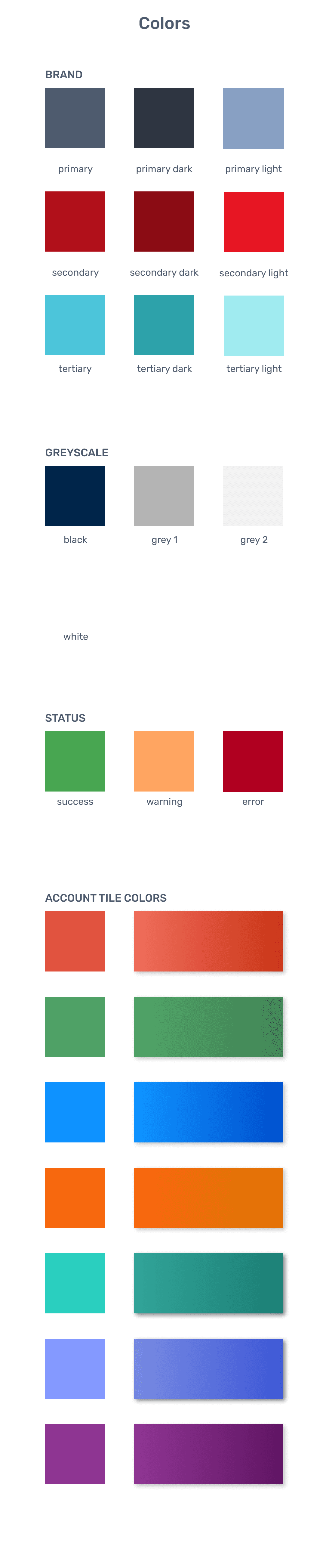
Colors evoke emotions and create a visual hierarchy within interfaces. For this application, I carefully crafted a color palette that aligned with the Broadway Bank brand identity, while also considering accessibility guidelines. By using contrasting colors strategically and implementing color variations for different states, I aimed to ensure an aesthetically pleasing and inclusive experience for all users.
Typography
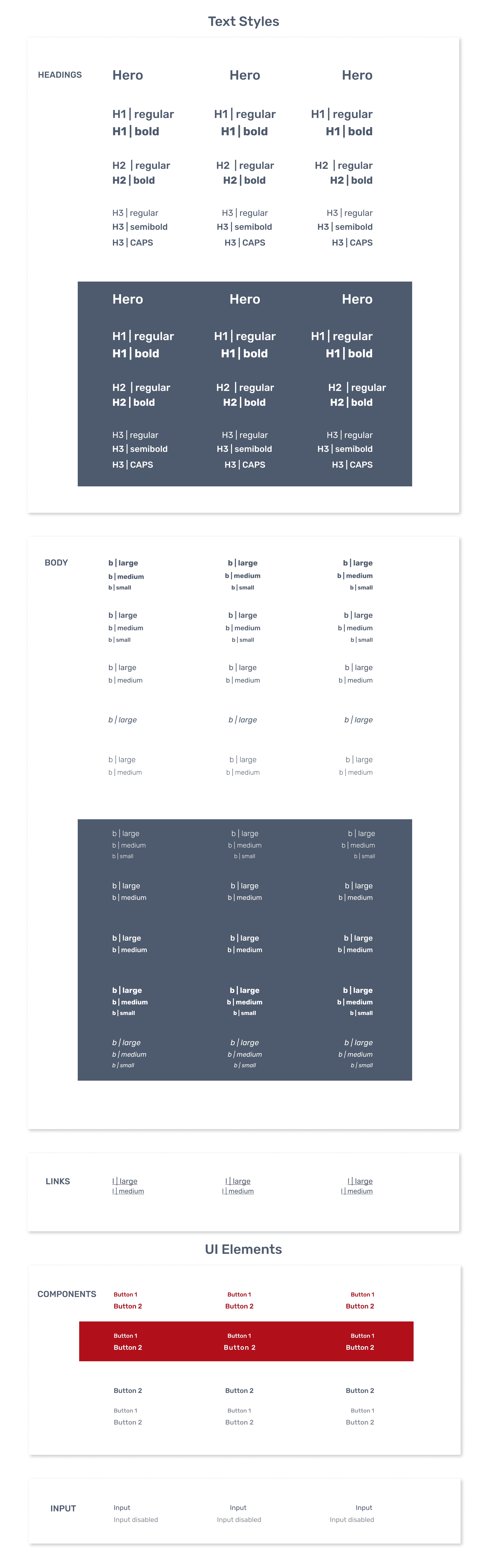
Typography plays a pivotal role in delivering a brand's message and establishing visual hierarchy. For this application, I explored various typographic choices, considering factors such as legibility, readability, and brand personality. By defining a typography system that harmonized with other design elements, I aimed to create a cohesive visual language that enhanced the overall readability and user experience.
